Comments
-
UC Davis Athletics Joining Mountain West - Football to FollowI think I question our commitment to winning at the FBS level once we get there. We coasted for 18 or so years after the D1 move before Building Edwards / Biggs and getting serious. I'd guess we could fall into that again. But who knows.
-
UC Davis Athletics Joining Mountain West - Football to FollowNot sure what I'd prefer......potentially being a top FCS program every year, or toiling around .500 and having some really fun winning years every decade in the FBS. I lived the toiling .500 experience as a Cal fan growing up. It had its charm.
Winning a lot in the FCS is currently very fun. -
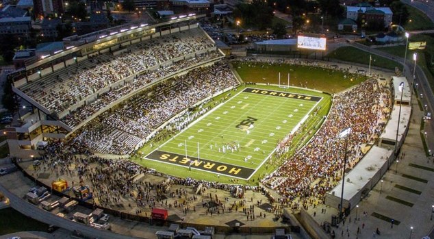
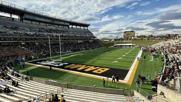
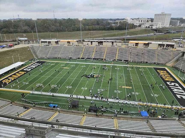
Aggie Ascent - Facilities Master Plan ReleaseSome Alabama State pics....Definitely a resemblance to Aggie Stadium in many ways.
When the Press Box add is built, the view over the campus and water tower is going to be nice (like the 3rd ASU pic).


 Attachments
 ASU 5.webp
(88K)
 ASU 2.webp
(44K)
 ASU 5.webp
(88K)
 ASU 6.webp
(468K)
-
MBB UC Davis (16-10, 9-6) at CSU Fullerton (13-14, 8-7), Thursday Feb. 19, 7 pm, on ESPN+Frustrating finish. Good to see some Aggie fans in the stands on TV.
-
Sac State's bid for the Pac 12 ThreadWith game guarantees and major increases to game revenue, Wood put it simply: “Football is paying for football.” — BlueGoldAg
The game revenue is the head-scratcher..... -
UC Davis (0-3) vs University of San Francisco (3-0) (2/18, 2 p.m PST)I really wanted to get over this afternoon to watch the Ags, but it didn't work out!
-
UC Davis Athletics Joining Mountain West - Football to Followare still in the fundraising stage and are working on securing funds. We will send an updated timeline once the project funding has been secured” — Jdur
This is what I was saying.....we 'ain't building nothin' yet. They've only just asked us to pay for it.
Sac and Davis are doing the same thing.....Sac is just pretending super hard. -
The Rivalry with Sac State needs to EndIf Cal Poly pulled this crazy BS, we'd be just as interested.
-
Sac State's bid for the Pac 12 ThreadWhen its a smart and beneficial decision for Davis football, we'll be in the MWC. No matter where Sac is.
You do realize that around 8/10 people think Sac made a bad decision/deal here right?
As a contrast, NDSU public sentiment is waaaaay more positive (comparing because the moves were made at nearly the same time).
Nothing to see here, I guess? -
UC Davis Athletics Joining Mountain West - Football to FollowSame here: 1 FBS game a year.
I think it should not be Sac every year. That would be great for them, dumb for us (for reasons we've beaten on over other threads...hah) -
UC Davis Athletics Joining Mountain West - Football to FollowI'm just saying we shouldn't do charity work. They should pay Davis like any other FCS school, I get that it could be less because of minimal travel and existing relationship. I'd take the game every couple years for $250k, which seems to be the low end payout for these games.
-
UC Davis Athletics Joining Mountain West - Football to Followso ticket sales aren't likely to dramatically increase — Riveraggie
The trick for attendance would be to get a cool new OOC opponent to come out every year if they could afford it..... and if they are willing to pay- Davis. Gonna be tough to get that OOC team to come to the current Hornet Stadium though.
I'm sure they'll get an initial spike with the excitement.......like they did with the Go-Go guy....but I'm sure excitement will fade again after Kent State and Bowling Green make a couple trips out. I doubt this amounts to more than 15,000 average attendance over 5 years (which is a little over where they are at now). What makes it even more difficult is likely going 4-8 every year to start. What they really need is an improved stadium to help interest.
NSDU is going to have a much better go at this..... It will be interesting to watch.
What I look forward to is Davis playing them again and getting back to beating a "bigger, faster" team from the upper classification......like the 1990's.
Went off-topic here, my bad! -
UC Davis Athletics Joining Mountain West - Football to FollowWe haven't reached the level of Montana, Montana State, NDSU, SDSU, JMU (before they left). We've been a competitive program at the FCS playoff level for only a few seasons. We are right on the outside of the top-tier. We've only been in the playoffs 4 times in 18 seasons. We are fighting against 23 years of apathy since moving to D1. Its going to take time.
Things are definitely heating up though. We are cooking now with the Plough extension. -
UC Davis Athletics Joining Mountain West - Football to Followlegitimately….how do we increase attendance among non-alumni/employee fans when our competition in the region is at a higher level and is more local to the population, especially when we spend far less on marketing and our product is stale? — RollOnYouAgs
I doubt Akron, Toledo, and for that matter Sac State will be seen as a higher level of competition than Cal Poly or Montana in our region to the casual Sac metro / Yolo / Solano resident.
To answer your question... facilities improvements, conference titles and deeper playoff runs in the coming seasons should increase attendance / demand for Aggie football.
If facilities improvements and winning don't improve attendance / demand for Aggie Football.....well, that falls under the "we have other problems" category I mentioned (mainly, Davis alums/students and community just don't like or care about football enough).
Time will tell! -
UC Davis Athletics Joining Mountain West - Football to Follow
I see us in the Big Sky for the foreseeable future. Which I love, as long as we are having consistent success at the level of the Montanas/Dakotas on the field and in the stands. It is time for the program to start dominating, as things are set up pretty well for that.
At this point if we aren't able to dominate at the level we are at, we have deeper issues. -
UC Davis Athletics Joining Mountain West - Football to FollowI may be reading too much into things, but the Plough 5-year extension ends about the time we should be making a decision, or perhaps a move. Seems like a good time for him to get paid or move on.
-
UC Davis Athletics Joining Mountain West - Football to FollowFor some reason, he has decided against announcing. I trust his judgement (the premature stadium renovation tweet makes sense now, although could have been executed better). I think its mostly because we aren't in a hurry and the program is doing ok financially year-to-year. Fundraising is a different story.
I believe Wood got a sh*t-or-get-off-the-pot warning regarding football. They clearly weren't in good shape.
SochorField

Start FollowingSend a Message
- Terms of Service
- Useful Hints and Tips
- Sign In
- Created with PlushForums
- © 2026 Aggie Sports Talk
