
-
 BlueGoldAg
1.7kI can't stand that blue field either. The only one that is worse is the red field at Eastern Washington. What an eyesore!
BlueGoldAg
1.7kI can't stand that blue field either. The only one that is worse is the red field at Eastern Washington. What an eyesore! -
 Akiltopmack99
65Also it would have been cool for the team to do a uniform update post on social media. Every little bit of promo counts towards building the fanbase and the brand.
Akiltopmack99
65Also it would have been cool for the team to do a uniform update post on social media. Every little bit of promo counts towards building the fanbase and the brand. -
Akiltopmack99
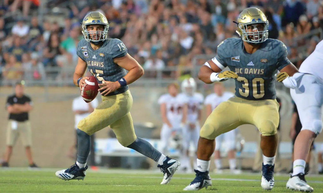
65After doing research, I would expect the Davis uniforms updates to be complete by next season.Smaller schools update one jersey per season. First was the Tahoe uniform last year (which I don’t like), then the home uniforms this year. The White uniforms templates should be updated next season. I’m happy with the home uniform updates.
-
Akiltopmack99
65If I could choose an alternate it would be a gold jersey, blue numbers, white accents. Light blue Tahoe is not a part of the brand. Brand growth is of the upmost importance right now as we are growing the program.
-
 Pacifico2
288Don't think I didn't notice the old logo next to your profile name, subliminal messaging!
Pacifico2
288Don't think I didn't notice the old logo next to your profile name, subliminal messaging!
My vote is to have a new retro uniform every year. Dig through the archives and have some fun with it.
I was against grey for most teams, but with the grey facemasks and gold numbers, those don't look bad! -
Akiltopmack99
65if we were to to alternates, either a gold jersey or throwback would be ideal. I’m not a fan of the Tahoe jerseys. We need to build the brand.
-
Akiltopmack99
65Another game day experience we need to improve on is the broadcast on game day. Davis doesn’t do a bad job on the game day broadcast (every home team produces their game day broadcast) but it could be much better. Davis broadcast mostly ran by students.
One thing they could do better is update the scorebug -
BlueGoldAg
1.7kI don't much care for the uniforms that we wore in the Portland State game with the white jerseys and the light tan pants. Just way too plain and bland for me.
-
Akiltopmack99
65expect them to be updated next year to match home uniforms. Please see my previous post
-
Akiltopmack99
65
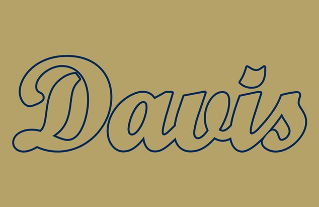
I also would like to say this should be our main logo for sports. It is easily recognizable, you read it and it says Davis. Davis needs to build its brand. The CA should be the secondary sports logo. -
Akiltopmack99
65Yup. It’s already the primary football helmets logo. Also the CA logo we have now is not the historic CA logo. The Davis logo on the helmets is the historic Davis helmet logo. Brand recognition for the win.
-
Akiltopmack99
65I’m not against wearing the CA logo on the helmets (I will be next year as the CA logo will be on the side of the jerseys. We should have Davis on all helmets at all times. We should also have “Davis” Script be on the field instead of the CA. Have the CA logos on the 25 yard lines.
-
 smarterray
81Anything is better than the Arena Football horse logo of the early 00s-10s. I like the old-timey collegiate feel of the lemon CA Heritage Logo, which predates the Davis script. Baseball had been using the lemon CA for decades. The Davis script is fine too.
smarterray
81Anything is better than the Arena Football horse logo of the early 00s-10s. I like the old-timey collegiate feel of the lemon CA Heritage Logo, which predates the Davis script. Baseball had been using the lemon CA for decades. The Davis script is fine too.
Just win, Ags. -
 SochorField
647CA logo works best for tickers, TV graphics, shirts, hats and branding in general. It is unique, and it stands out. Its not going anywhere.
SochorField
647CA logo works best for tickers, TV graphics, shirts, hats and branding in general. It is unique, and it stands out. Its not going anywhere.
Script Davis is also great, but its best on the helmet. -
Pacifico2
288YES!!! Now we're talking, crazy horses for days!
I'm a huge fan of the script DAVIS helmet logo. One of my pet peeves is having multiple fonts, so the Photoshopped DAVIS in the center of the field with the modern UC DAVIS and AGGIES in the end zones bothers me. There is a place for a CA logo, but I prefer the more traditional ones to the Cincinnati Reds CA. Just my two cents. -
Akiltopmack99
65I see where you are coming from. I thing a great compromise would be the CA logo center field and Davis script in the end zone, and Aggie script in the other end zone.
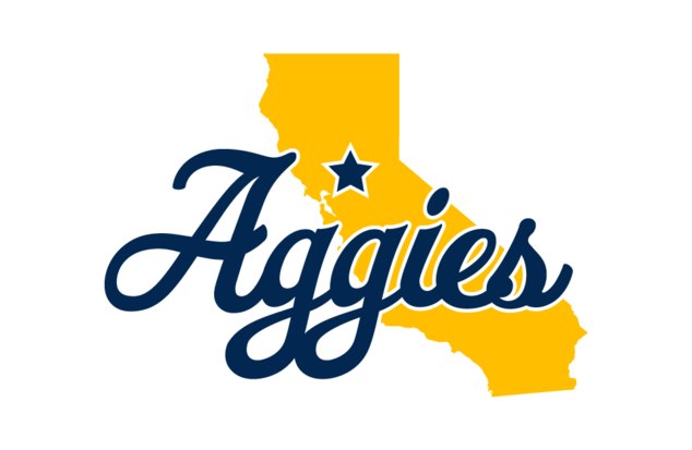
Or this logo center field with Davis logos in both end zones -
Akiltopmack99
65Either which way I think the school needs to get its branding together. I think the script Davis logo should be the primary sports logo for all sports.
Pacifico made a great point of having different fonts. It should all just be script imo




Welcome to Aggie Sports Talk!
AggieSportsTalk.com, the pulse of Aggie athletics. The home of Aggie Pride. Create an account to contribute to the conversation!
More Discussions
- Terms of Service
- Useful Hints and Tips
- Sign In
- Created with PlushForums
- © 2026 Aggie Sports Talk